April 09th,2021
5 Simple Tips for the search Bar
How to make search bar more effective in 5 ways
UI is the saddle, the stirrups, & the reins. UX is the feeling you get being able to ride the horse.
The Search bar, despite its simplicity, is usually one of the most frequently used elements on websites or applications. This makes the search bar design and usability a big deal.
Here are some of the best tips on how to design it correctly:
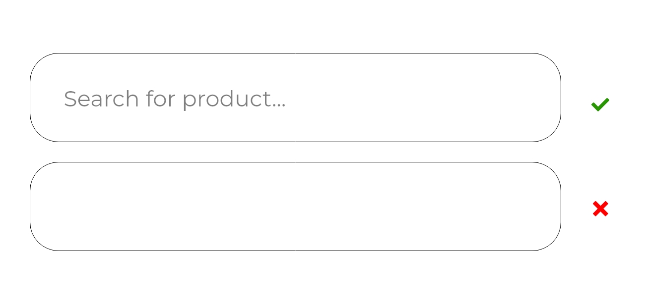
1. The placeholder text :
The placeholder text in the search bar describe the context of what we can look for on a given website or mobile application.
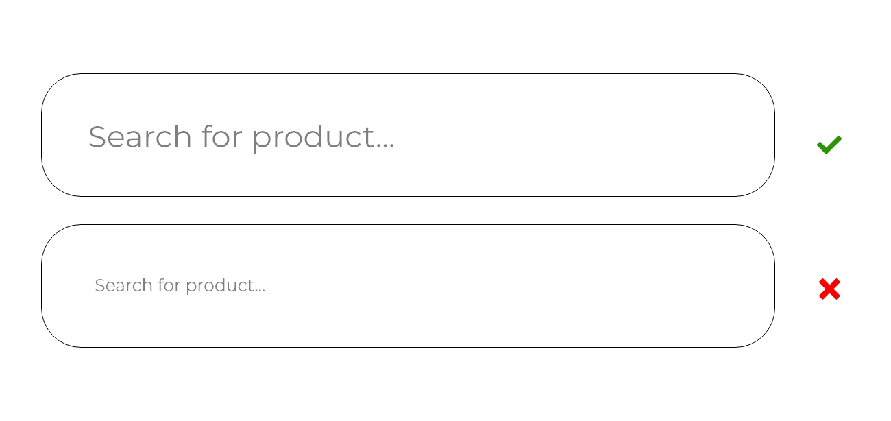
2. Don't Use a font size that is too small :
The font size in the search bar should be 16px - iOS browsers will zoom in on the search bar often obscuring the right side.
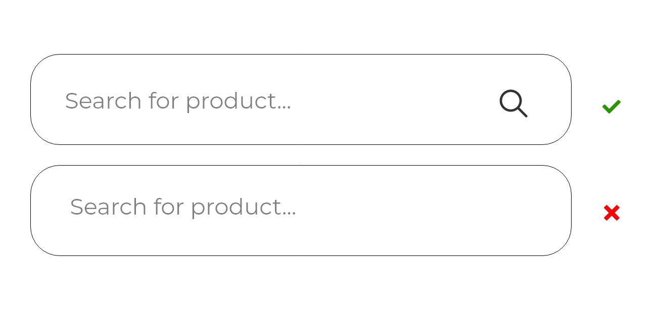
3. Include the search icon:
Often designers use icons to visually convey what the button is doing. In this case the magnifies icon acts as a button.
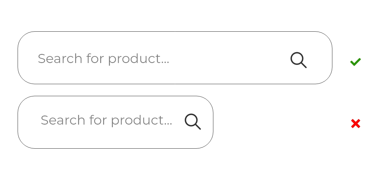
4. Don't Make the search box short:
The search bar should be long enough to contain the whole entered word or sentence. On mobile it should be almost the full width of the screen
5. Don't overdo it with creativity:
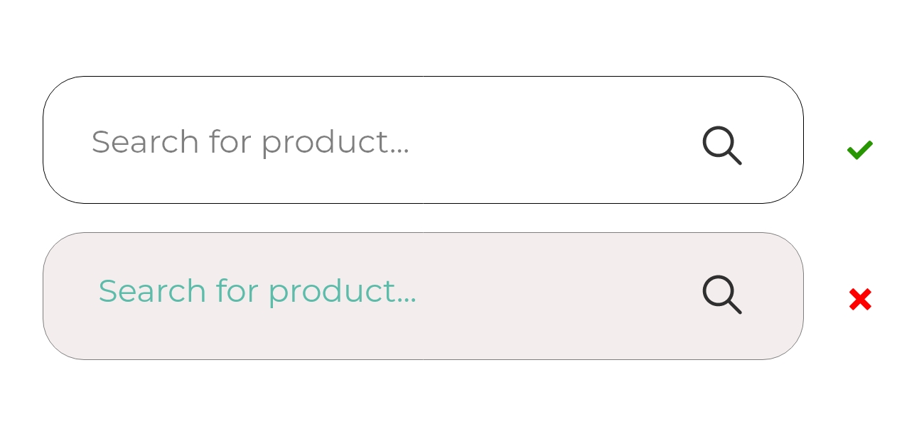
Designers want to be creative, and that's good but the search bar has to be a simple field to fill in and search for the phrase you want.
Final Thoughts
UX and UI are inextricably linked, but they are two very separate roles.
UI is all about the touchpoints the user encounters to navigate from A to B, such as buttons,searchbar, scrollbars and swipeable screens. All of these components have a huge impact on the overall UX of a product, and you can’t have one without the other.


