January 18th,2021
6 Tips On How To Use Typography
Follow these 6 Tips to Dominate Typography
A product is only ever as good as its UX. You can have the most innovative technology, but if it isn’t user-friendly, it will struggle to reach mainstream adoption.
The next big thing is the one that makes the last big thing usable.
Products like the iPod and the iPhone would never have become so popular based on the technology alone; what really sealed the deal is the fact that they have great UX.
Here are some of the best tips on how to design it correctly:
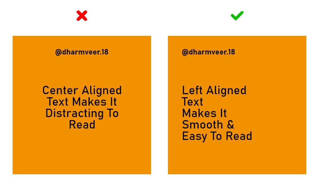
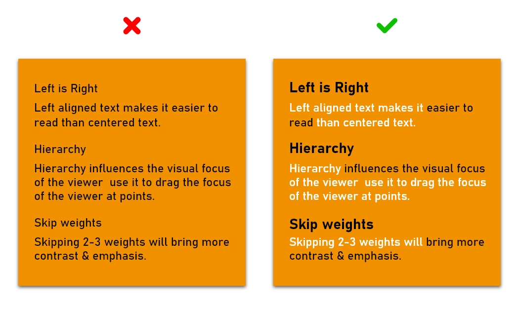
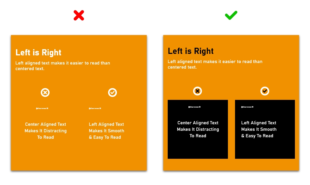
1. Left is Right :
Left aligned text makes it easier to read than centered text.
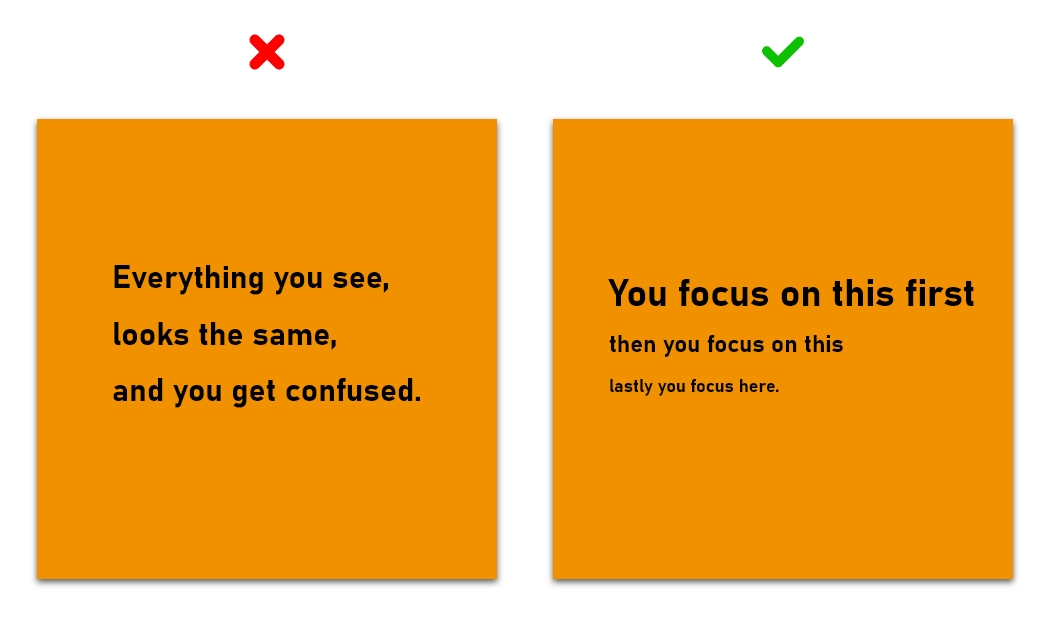
2. Hierarchy :
Hierarchy influences the visual focus of the viewer use it to drag the focus of the viewer at points.
3. Skip weights :
Skipping 2-3 weights will bring more contrast & emphasis.
4. Color Contrast :
Introduce a different color to highlight.
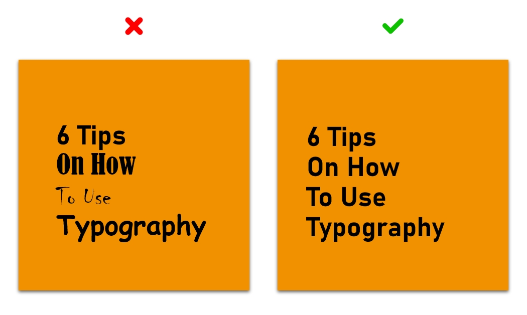
5. Less is more :
One is great two is good, but three is too much. More than 2 fonts makes the elements unstructured.
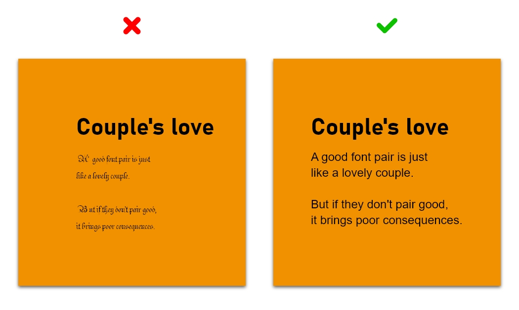
6. Couple's love :
A good font pair is just like a lovely couple. But if they don't pair good, it brings poor consequences.
Final Thoughts
It’s essential to design not just for the average user, but for all users. This means considering users with visual impairments, for example, as well as taking situational impairments — such as background noise — into account. Good UX is all about making technology user-friendly and accessible, after all, and this must include every segment of the population.