May 12th,2021
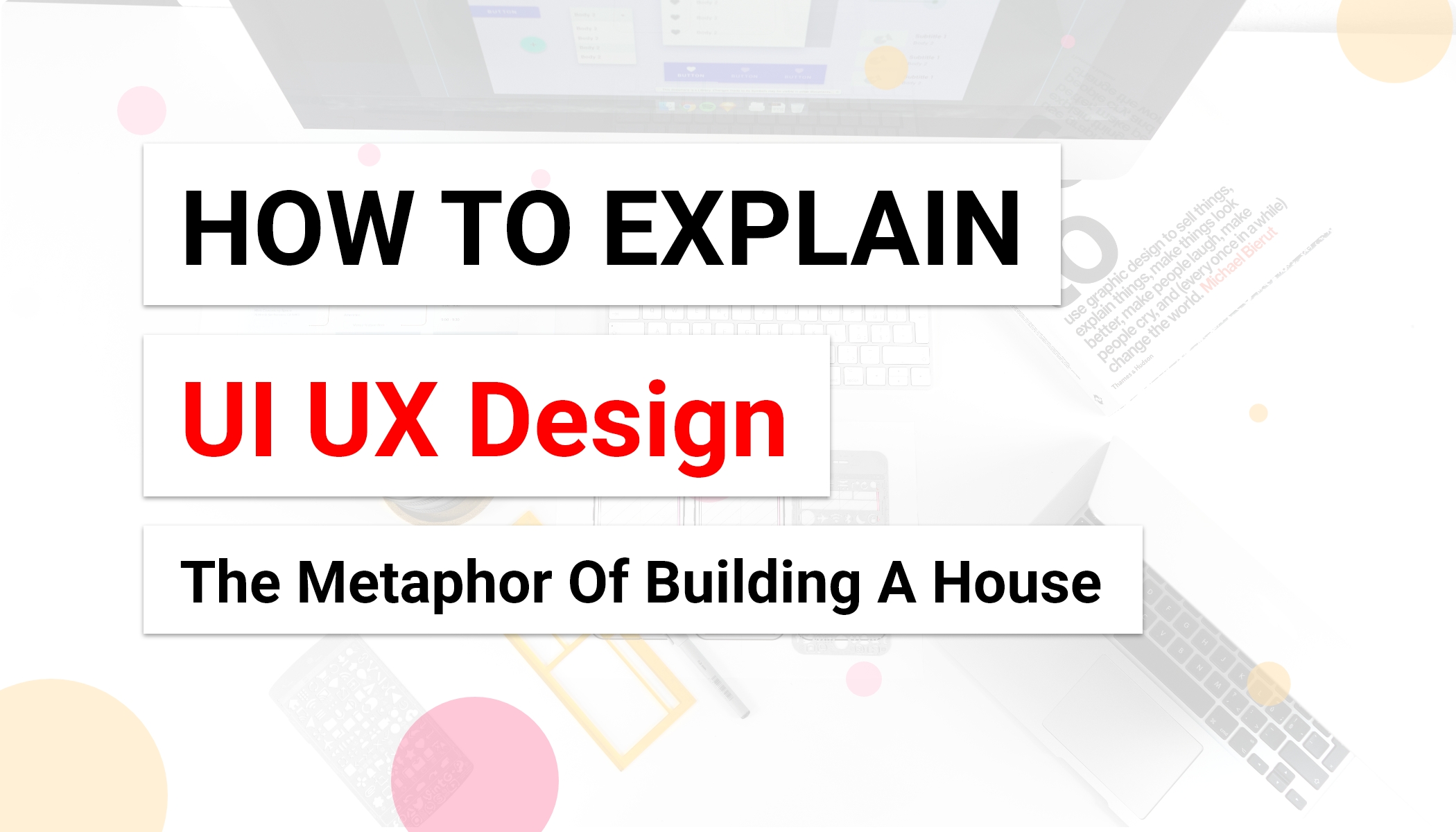
How To Explain UX and UI Design ?
The metaphor of building a house
As a designer, it’s important to think beyond apps and websites. Even if you’re working primarily in the digital space, remember that you’re literally surrounded by design.
Design is everywhere. From the dress you’re wearing to the smartphone you’re holding, it’s design.
From architecture to fashion, right down to the simplest everyday objects like a hairbrush or toothbrush, virtually everything has been designed for human use. Design really is everywhere, so take inspiration from your surroundings.
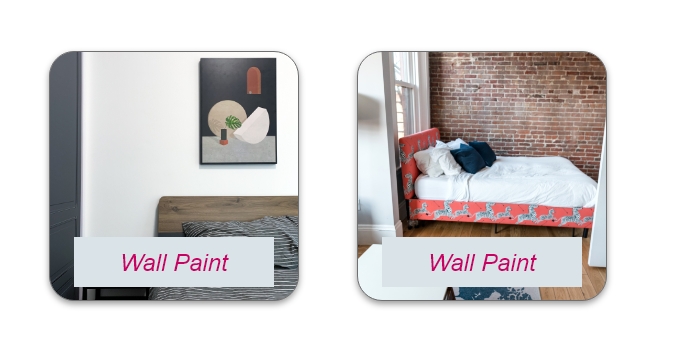
Imagine building a house :
Would you start by choosing the paint for the bedroom walls ?
Probably not, You would start with asking questions:
Who will be living in this house ?
let's choose between 5 members family or corporate employee
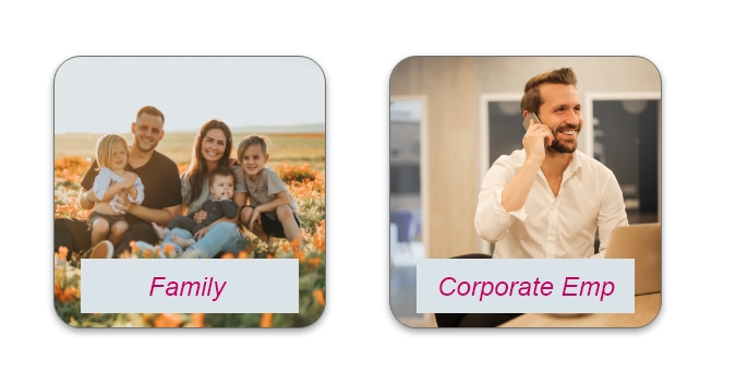
Let's assume you choose a family of 5 members(2 kids, Couple and an old father) going to live in this house.
Now your next question will be
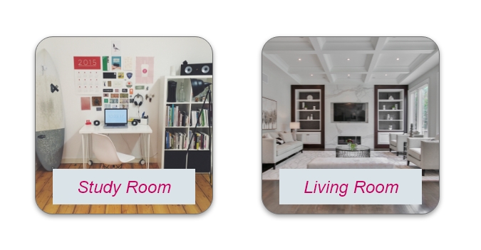
What rooms does this house need ?
As there are 2 kids, a couple and an old father going to live in this house. They Probably need a kids room,study room, Living room, guest room and 2 bedrooms for father and couple.
How will people navigate through the house ?
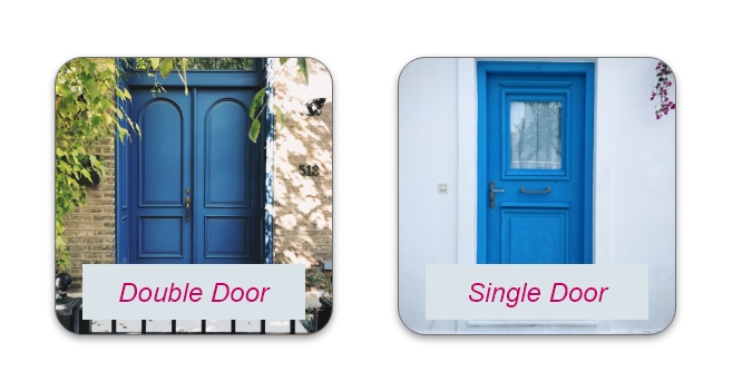
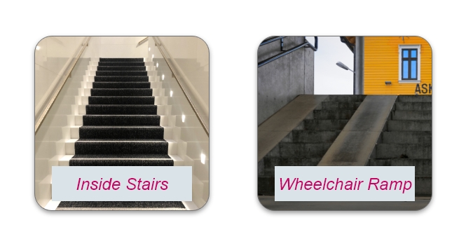
Now you know kids and an old father living in the house so considering their point of view doors, stairs will be chosen.
Like Sliding door,Double door, Single door
Stairs from inside or outside and Wheelchair Ramp
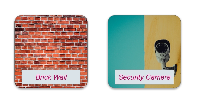
How can we make the house safe ?
Quality of materials used at the construction time, like bricks,cement. Structure testing for earthquakes and heavy rainfall or thunderstorms. Camera , Security Guard after you start living at home.
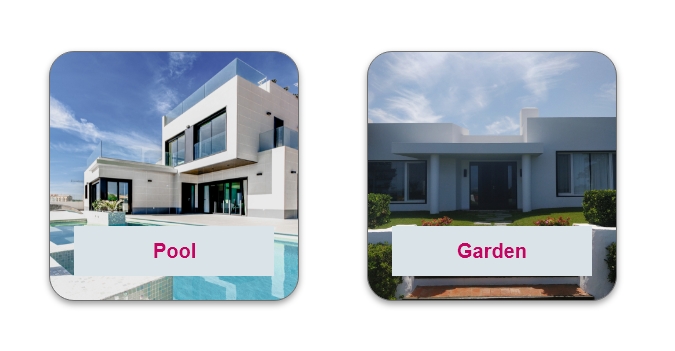
How can we make the house pleasant to live in ?
Garden, Pool, Proper Ventilation, Indoor outdoor lightning, art walls and more space after eliminating clutter etc.
A UX designer ask similar questions when designing an app :
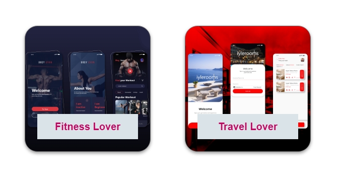
Who will be using this app ?
A UX designer is going to ask you similar questions like “who will be using this app?” It’s a gaming app, fitness app, grocery app, ecom app, medical app, or a music app etc.
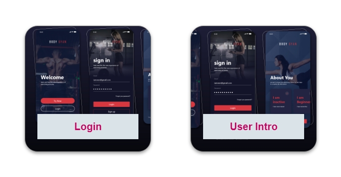
How will people navigate through this app ?
After you choose the service category, the question comes how users are going to navigate the app, like through login or try as a guest, menu bar, bottom navigation, looks similar to doors of a house how you are going from one room to another.
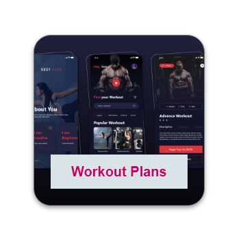
Which features should this app have ?
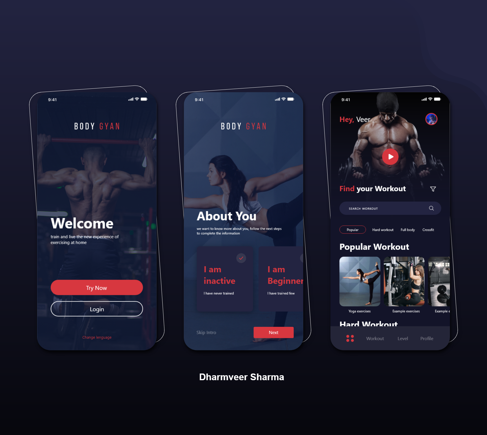
After choosing user flow, now comes features of the app. I am taking an example of a fitness app, for a fitness app workout plan must be included.
How can we make this app accessible, useful and enjoyable ?
Making your app accessible means you must consider the range of challenges a customer may face, ensuring that as many people as possible can use it. This includes those with impaired vision, motor difficulties, cognitive or learning difficulties, as well as deafness or impaired hearing.
5 steps to ensuring your app is accessible to all:
1. Create a simple, clear layout
2. Design a consistent navigation
3. Consider your text formatting
4. Make audio and video accessible
5. Give careful consideration to colour
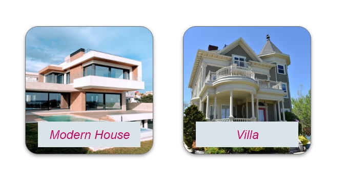
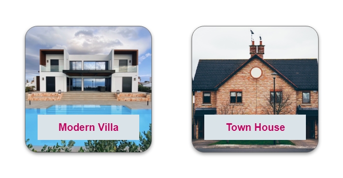
After we know the who, what and how of the house let's talk style :
A Mediterranean villa or A Victorian townhouse?
How will the interior look like? Modern or Art Deco?
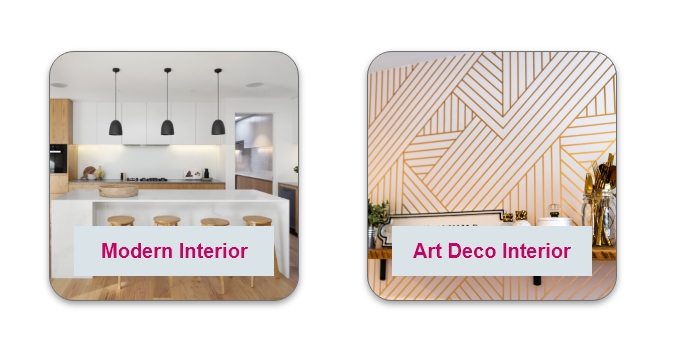
Style is the realm of the UI Designer
How can we maintain brand values into a design ?
Brand value depends on so many factors but design is one of those factors. Clear on vision and mission - your design should be appealing to brand values of your client before you start designing.
Let‘s say one of the brand values is “lightness”. So consider using bright colors, light fonts, low complex forms and maybe some subtle shadows.
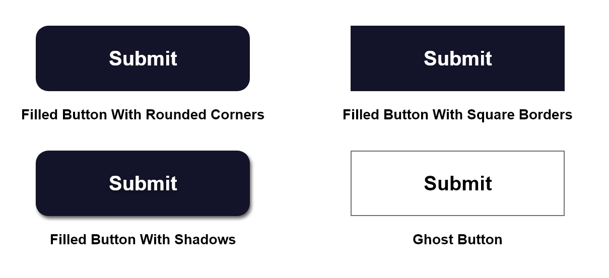
How should this button looks like ?
Buttons are an essential element of interaction design. They have a primary role in the conversation between a user and the system.
1. Make buttons look like buttonsWhen it comes to interacting with the user interface, users need to know instantly what is ‘clickable’ and what’s not. Every item in a design requires effort by the user to decode. Generally, the more time needed for users to decode the UI the less usable it becomes for them.
2. Don’t forget about the whitespaceNot only the visual properties of the button itself are important. The amount of whitespace near the button makes it easier (or harder) for users to understand whether it’s an interactive element or not.
3. Put buttons where users expect to find themButtons should be located in places where users can easily find them or expect to see. Don’t make users hunt for buttons. If users can’t find a button, they won’t know that it exists.
4. Label buttons with what they doButtons with generic or misleading labels can be a huge source of frustrations for your users. Write button labels that clearly explain what each button does. Ideally, the button’s label should clearly describe its action.
5. Properly size your buttonsButton size should reflect the priority of this element on the screen. Large button means more important action.
6. Mind the orderThe order for buttons should reflect the nature of a conversation between the user and the system. Ask yourself, what order users expect to have on this screen and design accordingly.
Use familiar designs for your buttons
Here are a few examples of buttons that are familiar to most users:
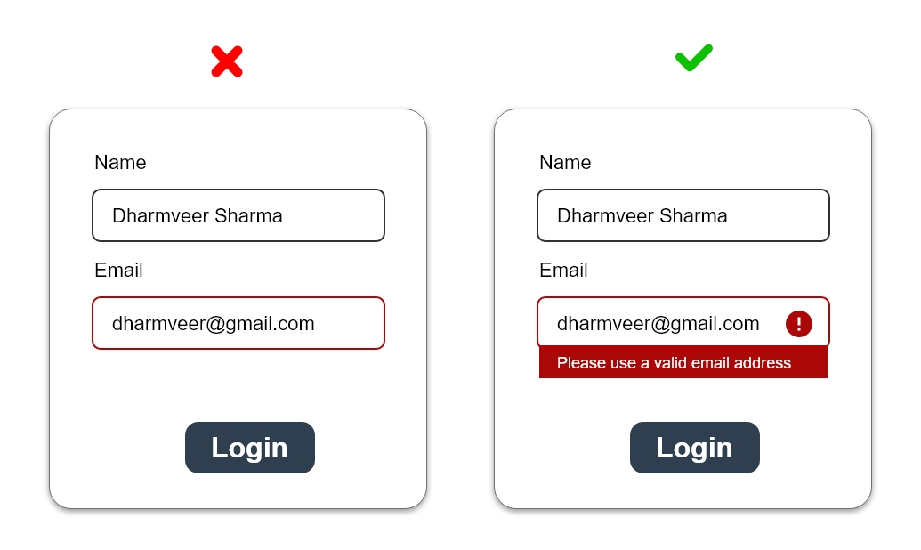
How can colors, brightness and contrast make a design more accessible ?
We often use color as a tool to convey status or meaning. A red background or border might denote an error. Green text may tell your user that an action was successful. Be careful not to rely solely on color to convey these messages, however, as those with color blindness may not see a distinction to understand your meaning.
Instead combine your use of color with shapes, icons, or textures to double down on your message. For instance, it’s common to use a colored circle as a quick status indicator in applications: a green circle might mean an item was approved or a service is up, and a red circle might mean the item was rejected or the service is down. To color blind users, there is little to no difference between a red and green circle. But a green circle and a red square? That’s a lot more obvious.
Final Thoughts
Design isn’t just about aesthetics. It’s the art of making things usable — be it an app, a gadget or a simple everyday object like a chair.
UX design is nothing without human interaction, and if a product isn’t fully able to serve its purpose, the design process is incomplete.
This is why user research and usability testing are so crucial, and as a UX designer, you need to be prepared to iterate and reiterate your designs over and over again.